by Jennifer Clark
On April 12, we will “celebrate” Equal Pay Day, held on a Tuesday every year to symbolize how far into a second work week women must work to earn the same amount men earn in a single work week. Research shows that the wage gap is real and has had adverse effects on women’s lifetime earnings and family economic security. Since pictures sometimes speak louder than words, here are a few charts that visualize the extent of the wage gap and what (un)equal pay means for women workers and their families.
|
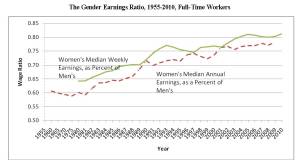
The Gender Earnings Ratio, 1955-2010 (IWPR), shows the wage gap as it has narrowed over time. In 1955, women earned about 64 percent of what men earned. Women now earn 77 percent of what men earn. Although narrowing, this chart shows that it has taken American women 55 years to close the wage gap a mere 13 percent. |
|
Projection for Pay Equity in 2056 (IWPR), prepared by IWPR for NBC Nightly News, shows that if current trends continue, women will achieve equal pay in 2056, 45 years from now. The original chart used for the projection provides more complete background on how IWPR arrived at this date. |
|
Women’s earnings and employment by industry, 2009 (Bureau of Labor Statistics), shows women’s earnings broken down by occupation. This chart underscores the fact that, even in industries where women are well-represented in the workforce, a gender wage gap still exists. For example, more women are employed in “education & health services” than in any other category included in the chart, yet women in this industry still only earn 77 percent of what their male counterparts earn. |
To view interactive maps relating to pay equity by state, the American Association of University Women (AAUW) has a Gender Wage Gap map and the Center for American Progress has a map on the percentage of female breadwinners.
Jennifer Clark is the Development Coordinator at the Institute for Women’s Policy Research.
About the author
- Administrator
- Administrator
- Administrator
- Administrator
- Administrator
- Administrator
- Administrator
- Administrator
- Administrator
- Administrator
- Administrator
- Administrator
- Administrator
- Administrator
- Administrator
- Administrator
- Administrator
- Administrator
- Administrator
- Administrator
- Administrator
- Administrator
- Administrator
- Administrator
- Administrator
- Administrator
- Administrator
- Administrator
- Administrator
- Administrator
- Administrator
- Administrator
- Administrator
- Administrator
- Administrator
- Administrator
- Administrator
- Administrator
- Administrator
- Administrator
- Administrator
- Administrator
- Administrator
- Administrator
- Administrator
- Administrator
- Administrator
- Administrator
- Administrator
- Administrator
- Administrator
- Administrator
- Administrator
- Administrator
- Administrator
- Administrator
- Administrator
- Administrator
- Administrator
- Administrator
- Administrator
- Administrator
- Administrator
- Administrator
- Administrator
- Administrator
- Administrator
- Administrator
- Administrator
- Administrator
- Administrator
- Administrator
- Administrator
- Administrator
- Administrator
- Administrator
- Administrator
- Administrator
- Administrator
- Administrator
- Administrator
- Administrator
- Administrator
- Administrator
- Administrator
- Administrator
- Administrator
- Administrator
- Administrator
- Administrator
- Administrator
- Administrator
- Administrator
- Administrator
- Administrator
- Administrator
- Administrator
- Administrator
- Administrator
- Administrator
- Administrator
- Administrator
- Administrator
- Administrator
- Administrator
- Administrator
- Administrator
- Administrator
- Administrator
- Administrator
- Administrator
- Administrator
- Administrator
- Administrator
- Administrator
- Administrator
- Administrator
- Administrator
- Administrator
- Administrator
- Administrator
- Administrator
- Administrator
- Administrator
- Administrator
- Administrator
- Administrator
- Administrator
- Administrator
- Administrator
- Administrator
- Administrator
- Administrator
- Administrator
- Administrator
- Administrator
- Administrator
- Administrator
- Administrator
- Administrator
- Administrator
- Administrator
- Administrator
- Administrator
- Administrator
- Administrator
- Administrator
- Administrator
- Administrator
- Administrator
- Administrator
- Administrator
- Administrator
- Administrator
- Administrator
- Administrator
- Administrator
- Administrator
- Administrator
- Administrator
- Administrator
- Administrator
- Administrator
- Administrator
- Administrator
- Administrator
- Administrator
- Administrator
- Administrator
- Administrator
- Administrator
- Administrator
- Administrator
- Administrator
- Administrator
- Administrator
- Administrator
- Administrator
- Administrator
- Administrator
- Administrator
- Administrator
- Administrator
- Administrator
- Administrator
- Administrator
- Administrator
- Administrator
- Administrator
- Administrator
- Administrator
- Administrator
- Administrator
- Administrator
- Administrator
- Administrator
- Administrator
- Administrator
- Administrator
- Administrator
- Administrator
- Administrator
- Administrator
- Administrator
- Administrator
- Administrator
- Administrator
- Administrator
- Administrator
- Administrator
- Administrator
- Administrator
- Administrator
- Administrator
- Administrator
- Administrator
- Administrator
- Administrator
- Administrator
- Administrator
- Administrator
- Administrator
- Administrator
- Administrator
- Administrator
- Administrator
- Administrator
- Administrator
- Administrator
- Administrator
- Administrator
- Administrator
- Administrator
- Administrator
- Administrator
- Administrator
- Administrator
- Administrator
- Administrator
- Administrator
- Administrator
- Administrator
- Administrator
- Administrator
- Administrator
- Administrator
- Administrator
- Administrator
- Administrator
- Administrator
- Administrator
- Administrator
- Administrator
- Administrator
- Administrator
- Administrator
- Administrator
- Administrator
- Administrator
- Administrator
- Administrator
- Administrator
- Administrator
- Administrator
- Administrator
- Administrator
- Administrator
- Administrator
- Administrator
- Administrator
- Administrator
- Administrator
- Administrator
- Administrator
- Administrator
- Administrator
- Administrator
- Administrator
- Administrator
- Administrator
- Administrator
- Administrator
- Administrator
- Administrator
- Administrator
- Administrator
- Administrator
- Administrator
- Administrator
- Administrator
- Administrator
- Administrator
- Administrator
- Administrator
- Administrator
- Administrator
- Administrator
- Administrator
- Administrator
- Administrator
- Administrator
- Administrator
- Administrator
- Administrator
- Administrator
- Administrator
- Administrator
- Administrator
- Administrator
- Administrator
- Administrator
- Administrator
- Administrator
- Administrator
- Administrator
- Administrator
- Administrator
- Administrator
- Administrator
- Administrator
- Administrator
- Administrator
- Administrator
- Administrator
- Administrator
- Administrator
- Administrator
- Administrator
- Administrator
- Administrator
- Administrator
- Administrator
- Administrator
- Administrator
- Administrator
- Administrator
- Administrator
- Administrator
- Administrator
- Administrator
- Administrator
- Administrator
- Administrator
- Administrator
- Administrator
- Administrator
- Administrator
- Administrator
- Administrator
- Administrator
- Administrator
- Administrator
- Administrator
- Administrator
- Administrator
- Administrator
- Administrator
- Administrator
- Administrator
- Administrator
- Administrator
- Administrator
- Administrator
- Administrator
- Administrator
- Administrator
- Administrator
- Administrator
- Administrator
- Administrator
- Administrator
- Administrator
- Administrator
- Administrator
- Administrator
- Administrator
- Administrator
- Administrator
- Administrator
- Administrator
- Administrator
- Administrator
- Administrator
- Administrator
- Administrator
- Administrator
- Administrator
- Administrator
- Administrator
- Administrator
- Administrator
- Administrator
- Administrator
- Administrator
- Administrator
- Administrator
- Administrator
- Administrator
- Administrator
- Administrator
- Administrator
- Administrator
- Administrator
- Administrator
- Administrator
- Administrator
- Administrator
- Administrator
- Administrator
- Administrator
- Administrator
- Administrator
- Administrator
- Administrator
- Administrator
- Administrator
- Administrator
- Administrator
- Administrator
- Administrator
- Administrator
- Administrator
- Administrator
- Administrator
- Administrator
- Administrator
- Administrator
- Administrator
- Administrator
- Administrator
- Administrator
- Administrator
- Administrator
- Administrator
- Administrator
- Administrator
- Administrator
- Administrator
- Administrator
- Administrator
- Administrator
- Administrator
- Administrator
- Administrator
- Administrator
- Administrator
- Administrator
- Administrator
- Administrator
- Administrator
- Administrator
- Administrator
- Administrator
- Administrator
- Administrator
- Administrator
- Administrator
- Administrator
- Administrator
- Administrator
- Administrator
- Administrator
- Administrator
- Administrator
- Administrator
- Administrator
- Administrator
- Administrator
- Administrator


